The simulatorInteractive simulation
Same photo. Two sets of eyes.Side-by-side simulation
Normal vision on the left, the filtered version on the right. The wall behind everything shifts too. That's not decoration, it's the same maths running on the background.The left panel is unmodified. The right applies the Machado transform for the selected type and severity. The page background is driven by the identical transform, so the entire viewport reflects the selected simulation rather than only the image pairs.
80%
This is set to your result.Configured from your screening responses.
Move it to see how much the same picture varies across the range. The far end is the rare, total version: real, but not what most of us live with.Severity 1.0 corresponds to dichromacy (the complete absence of a functioning cone class), which is considerably rarer than anomalous trichromacy. Intermediate values are interpolated between the published matrices.

Find the red one.Search by hue fails; search by position or lettering does not.
PhotoPhotographer: Chris F

Pink and red nearly meet, then stop: pink carries blue, and blue is not what goes missing.Rose pink against saturated red. Both red-green forms compress the separation substantially without eliminating it, because the short-wavelength component of the pink is untouched by an L or M cone shift.

Purple is blue with red in it. Take the red away and it is navy.Deep navy against violet. Violet excitation is split between short and long wavelengths, so removing the long-wavelength contribution collapses it onto the navy, leaving almost nothing between them under either red-green form.

Not two colors that happen to look alike. One color with two names.Olive against mid brown. The M-cone shift that defines deuteranomaly removes very nearly all of the separation between them.

This is the one that makes people ask, out loud, whether that is grey or green.Protanomaly and deuteranomaly both nearly erase this difference, since teal's hue is exactly the information a shifted L or M cone stops carrying.
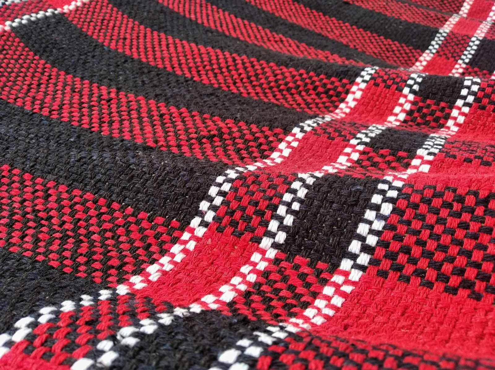
Red does not slide toward green here, it slides toward black. Two bands of the check become one.Red/black/white tartan, macro detail. Protanomaly's shifted L-cone response lowers the perceived luminance of long wavelengths, darkening red toward black rather than toward green, so the weave's two dominant bands converge under the transform.
PhotoPhotographer: Andres Rivas
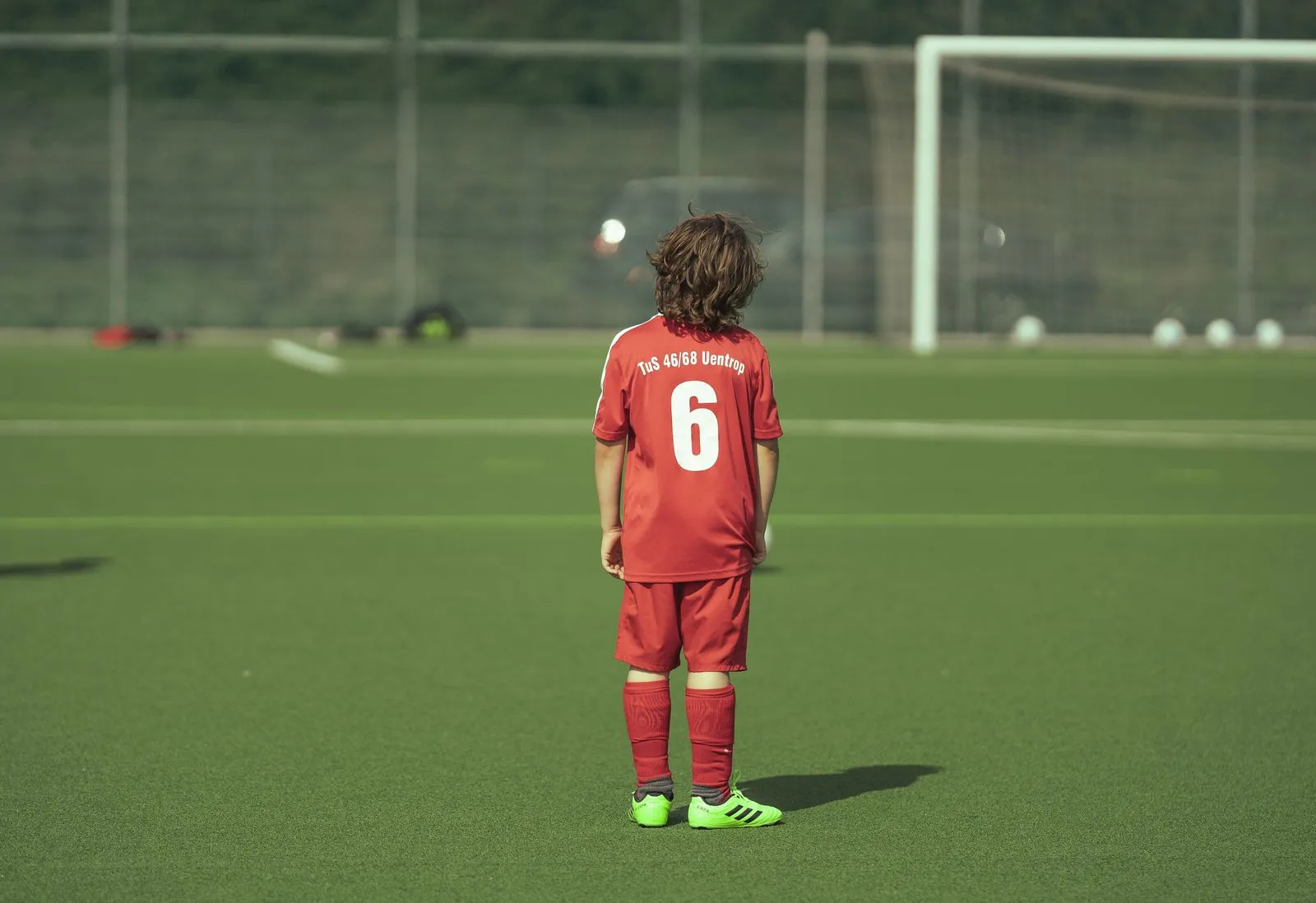
Two teams, one color. This is why the offside call gets argued about.A red kit against green artificial turf, the two dominant hue bands whose separation both deuteranomaly and protanomaly compress most.
PhotoPhotographer: Omar Ramadan
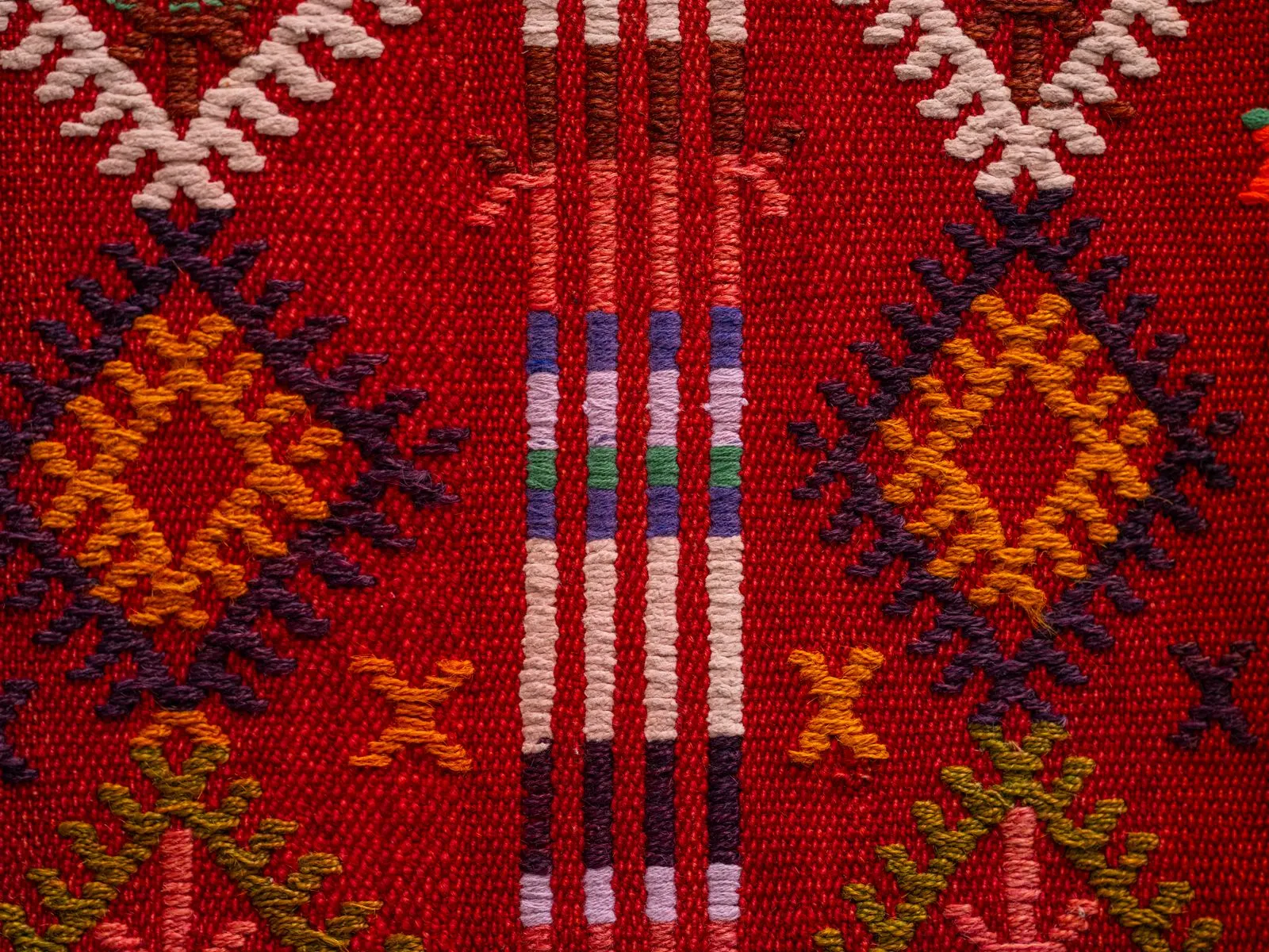
The pattern is doing nothing at all if you cannot separate it from the ground.A multicolor kilim: red ground, orange and indigo lattice motifs, and a central striped band mixing green and violet, several of the hue families this page already shows collapsing on their own.
PhotoPhotographer: Engin Akyurt
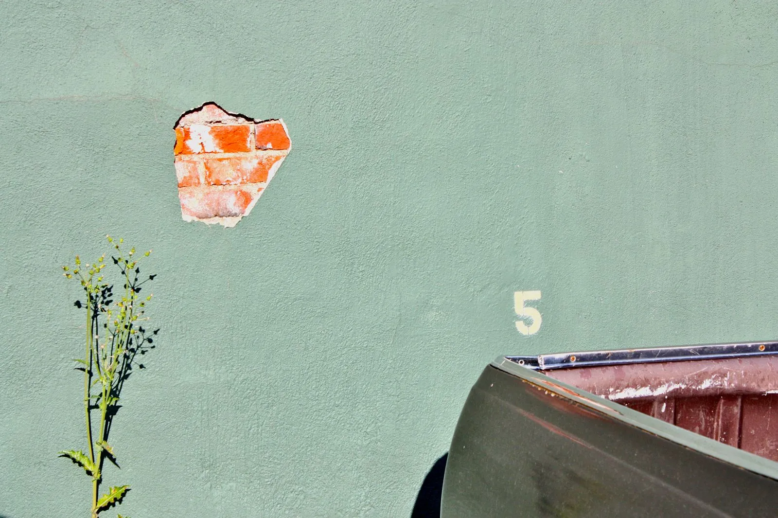
Somebody chose these two off a paint chip. Only one of us can tell.Sage-green masonry paint with an exposed brick-red patch of render damage. Sage and terracotta sit close to the protan and deutan confusion line, converging toward a shared mid-tone under either transform.
PhotoPhotographer: Eric Lane Barnes
What this is showing youScope of the simulation
This shows you which colours stop being tellable apart. It is not a photograph of what is in somebody else's head, and nothing can be. Ask a colorblind person to look at the filtered version and they will usually say the red still looks red, because their eyes do the same thing to both halves, and red is the word they have always used for it.The transform demonstrates loss of chromatic discrimination, not subjective appearance. It identifies which stimulus pairs become effectively indistinguishable for the modelled observer; it makes no claim about the observer's experience, which is not externally accessible. An anomalous trichromat viewing this page applies the same transform again to both panels and will typically report little difference between them.
The exchange that made this worth sayingDiscussion of scope and the naming effect
Try one of your ownUpload an image
Drop in a photo and the same filter runs on it. It never leaves your browser. There's nowhere for it to go, because there's no server here to send it to.Images are processed entirely client-side via CSS filters on an object URL. No upload occurs; the site is statically hosted and has no endpoint capable of receiving one.